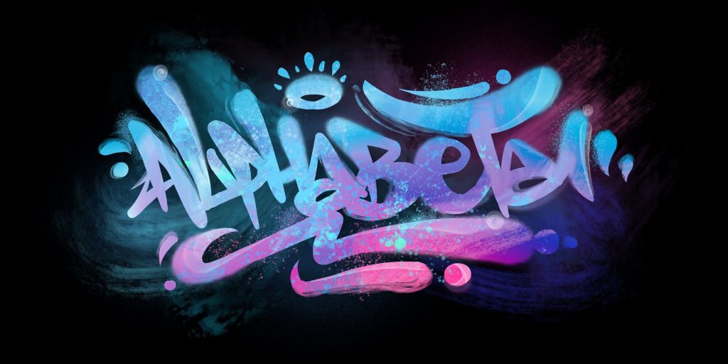
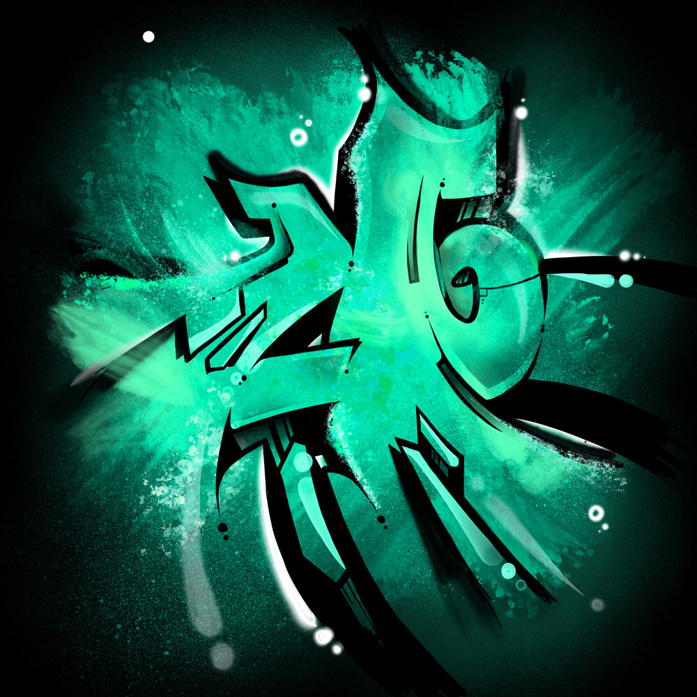
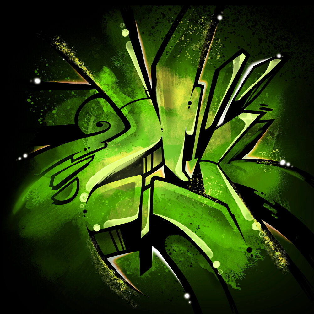
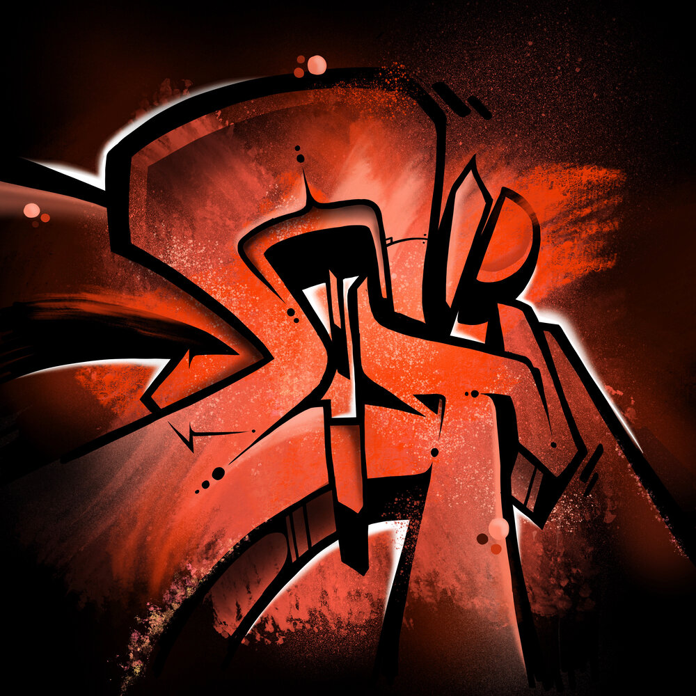
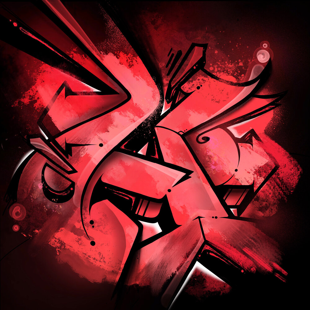
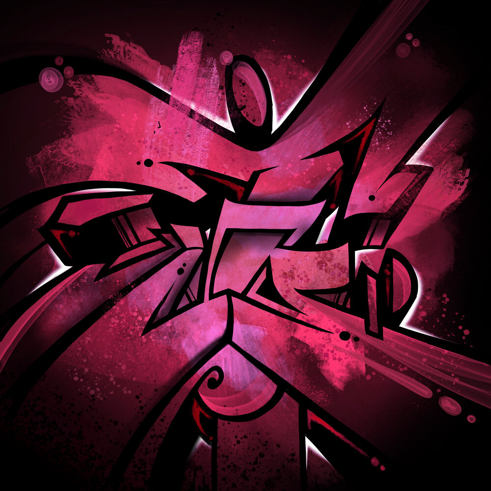
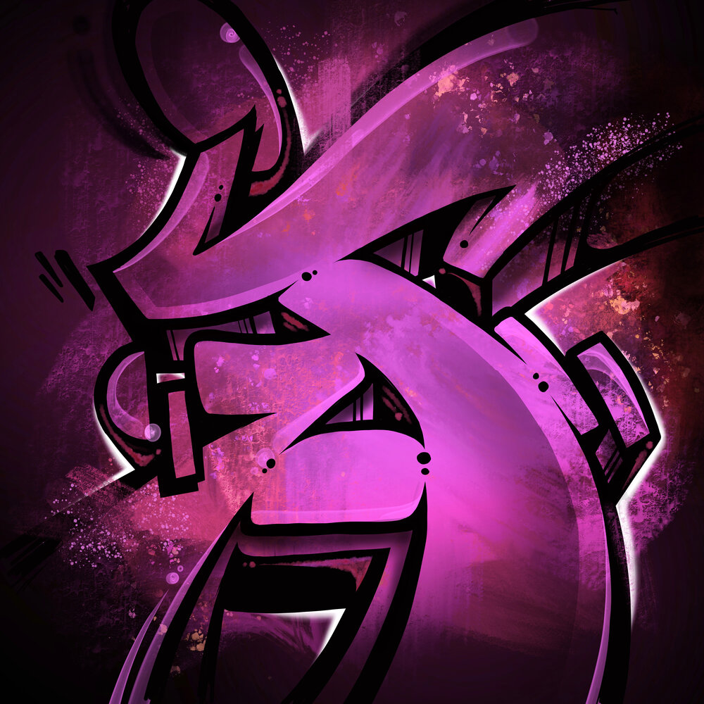
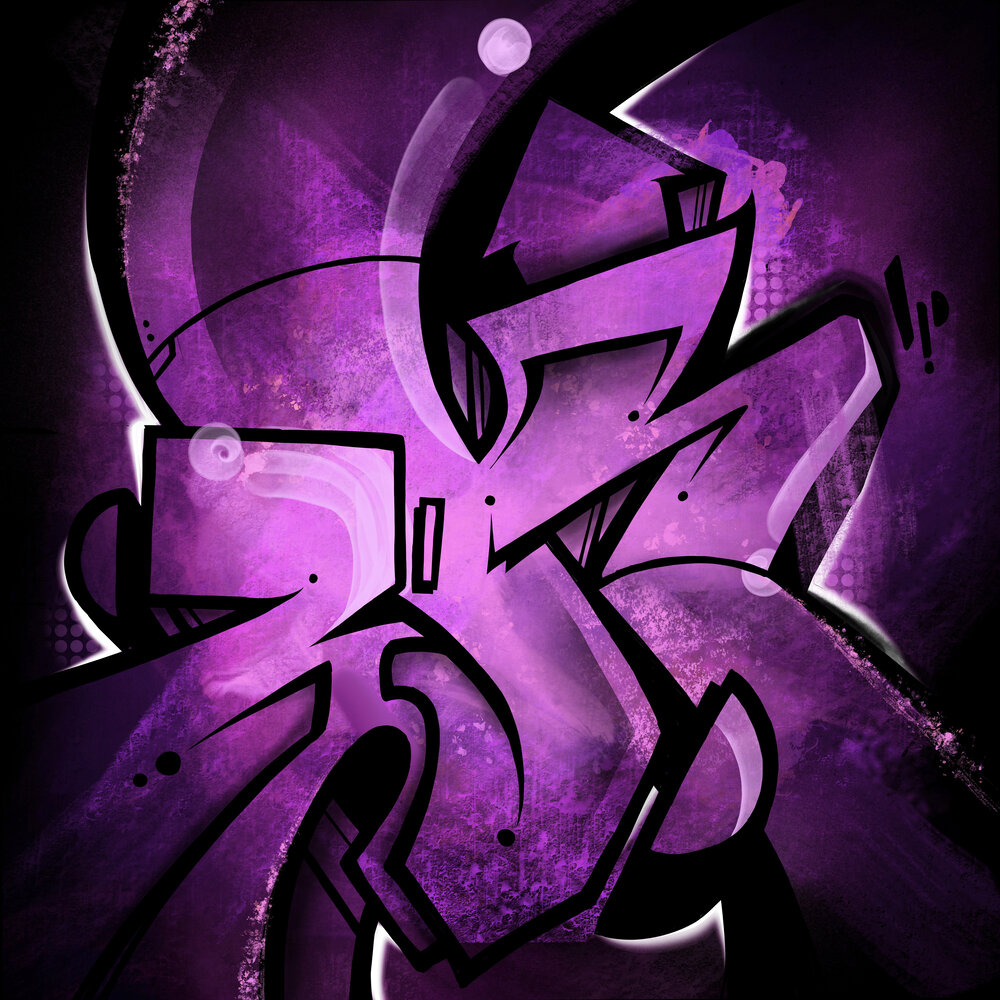
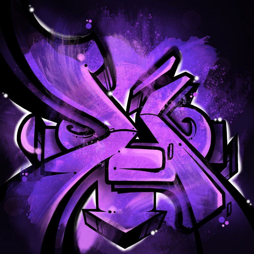
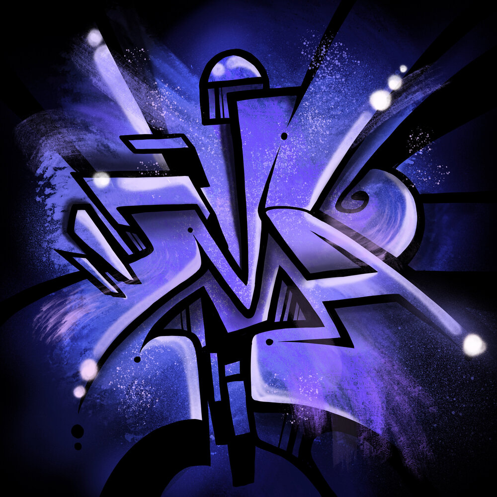
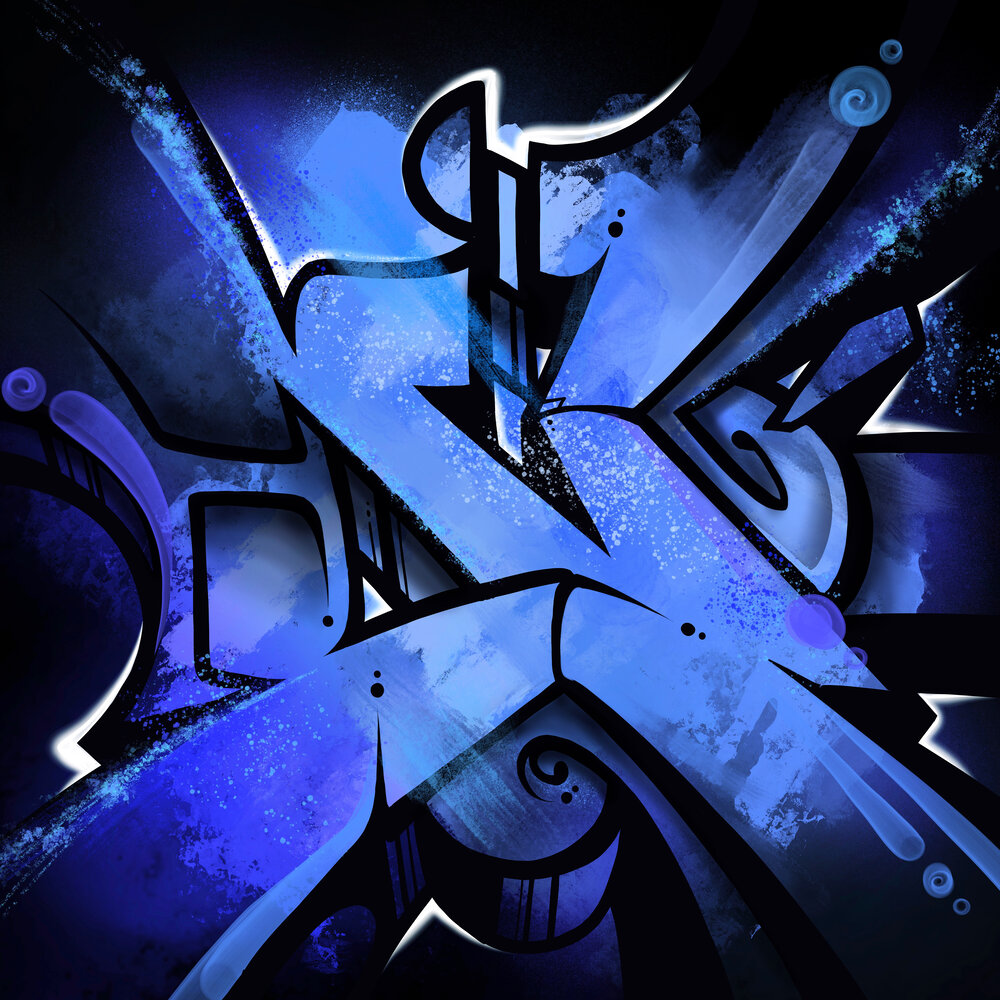
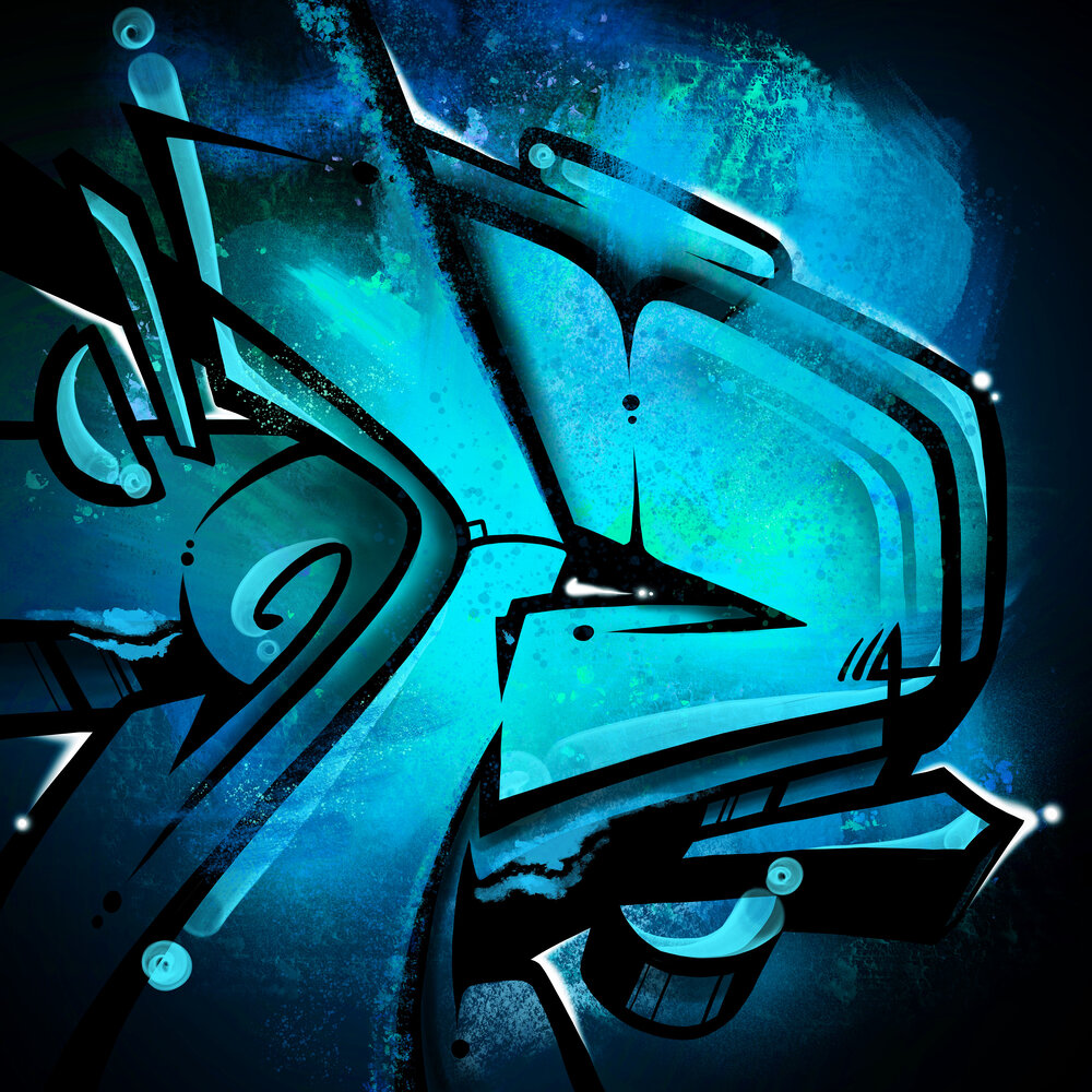
I was originally working on this collection of letters for the 36 Days of Type project, but was sidetracked by the craziness of life and decided to stop at “Z”. In any case, I am happy with how these turned out. I’ve always been really critical of my own letters and making sure they have good flow and movement. Graffiti should feel like the letter have come to life. I was also intrigued to play with layering different types of mediums and the abstraction of the form. Alphabeta is an exploration of those two things. Here is what I came up with…